Be prepared by Mario Mirabile

Two minutes and sixteen seconds. That's all that separates the first image from the second. I'm not holding these pictures up as great art, particularly as they were shot through a dirty office window. I'm just making the point that when great light happens, you'll miss it if you blink. You have to be ready to grab it, and grab it quickly. It's not going to hang around and wait for you to get your camera settings right.

I encountered the most amazing combination of light and sky as I cycled past Brighton Yacht Club just after dawn on a still and frosty winter morning. The clouds had formed intricate and delicate patterns, and even though I was looking west, they caught the dawn light in a spectacular orange display. Coupled with the still water and reflected yachts, the scene was breathtaking. I pulled over and fished out the Olympus C-8080WZ which at the time was my take everywhere camera. An almost pro level camera in its day (2003), it was showing its age by 2011. It had a fine lens and good image quality, but was hampered by its ageing technology. Slow and hesitant autofocus, ISO that needed to be kept to 100 or lower, a tiny LCD, ho-hum viewfinder and insanely slow card write times (14 seconds for one RAW file!!!!). It didn't help that just as I pulled over, my riding companion arrived from the opposite direction, so, rather than take what time the light allowed, I rattled off a series of shots and was on my way.

When I checked the images, all I found was a mass of blur - I'd been shooting at 1/8 second. I can't remember why the camera was set the way it was, but since then, I've gotten into the habit (most of the time) of resetting my camera to a default state before I turn it off. That way, when I turn it on I know what I'm starting with, so hopefully I won't be caught short next time great light happens.

Tech talk
Both images Olympus E-30, 14-54mm f2.8-3.5 mk1 lens, aperture priority at f4.5, -.3EV,. The extra blue tint probably comes from the (admitedly not too clean) office windows.

Shooting in the dark by Mario Mirabile

Modern camera equipment is remarkably capable, able to take photos in all sorts of difficult lighting. But some situations are designed to defeat all but the latest top flight pro equipment. Such was the case at the Fox Hotel in Collingwood this evening where Slim Dime and the Prairie Kings were performing their upbeat hillbilly boogie.

The lighting was the usual crazy venue mix of incandescent, fluorescent and LED. Surprisingly, however, it all managed to blend together to produce quite a decent level and color of lighting - as long as you wanted to photograph the band's shoes that is. The main LED light were angled down so that the performers' faces were almost always in shadow, resulting in unworkable shutter speeds and ISO settings. Fortunately the music was lively and entertaining, and I did manage to get a few nice shots of the lead singer, Jen, who found the light from time to time.

A great band and well worth seeing if they're playing down your way.

Tech talk
Both images were shot with my Olympus E-5 and Zuiko Digital 35-100mm f2.0 at f2.0. The first image was ISO 1600 at 1/80s, the other at ISO 3200 at 1/125s. I'm usually reluctant to shoot above ISO 800, but the lack of light here dictated otherwise. I'm surprised at how well the ISO 3200 shot came up, but it shows that high ISO is not a critical problem as long as you're not shooting into deep shadow. I wouldn't try making a big print out of it, but it's fine for web display. Most shots at this ISO, but in shadow, were pretty much unusable. Also, autofocus was quite slow difficult, particularly as the band members were moving around the stage. Of the 150 frames from the gig, I probably got 6 images I'd be happy to use.

RAW processed in Lightroom 5.2 and Photoshop CS6.

Get to the point (with thanks to Mr. B) by Mario Mirabile

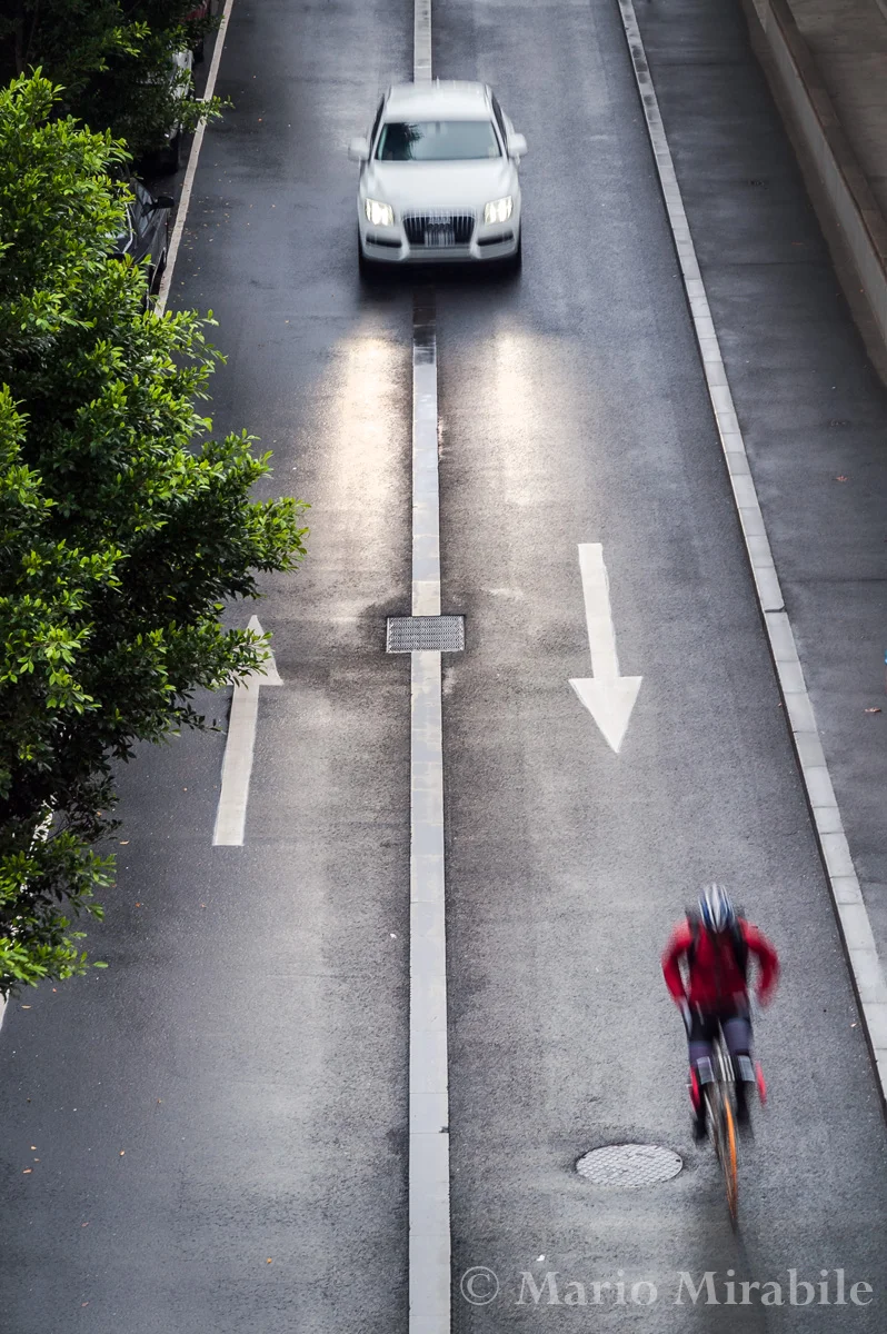
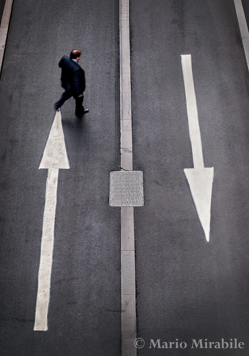
Scott is a recent addition to our lunchtime photo troupe. Each week he has managed to produce at least one image which reveals a good eye for simple and striking composition. This week it was a picture centered on the traffic flow arrows painted on the road just outside the building we work in. I knew the scene immediately, having seen it any number of times, but I'd never really seen it quite the way Scott had. I suppose the interesting compositional possibilities had been lost in far more mundane surroundings, but, armed with this new perspective, I decided to explore the possibilities for myself.

The roadway in question runs under an overpass which provides a vantage point about 15 metres above the road. Perhaps too high, but there's no way to get into a lower position. There's really no more to do than frame the shot, wait for someone to come into view, and hope they provide a point of additional interest. Quite a pleasant way to pass the time, if you can cope with the curious stares that come your way.

As for the third image, I took it last year and have been looking for a place to put it. It has an arrow of sorts, so it sort of fits the theme here. Besides, it was taken only a few metres from the other two. PHUGAZI? Don't ask me.

Stillness by Mario Mirabile

There's something very calming about the process of creating a still life image. After deciding on a subject, it's all so slow and deliberate. The careful selection and precise arrangement and re-arrangement of props and lighting is something that probably hasn't changed for hundreds of years. What has changed is our ability to quickly see if our careful planning is giving us the desired results. If not, we can make a few subtle changes and go again - much quicker than scraping the oil off a canvas and starting from scratch. 

The photo of the glasses is also interesting for me because it's one of the rare occasions when I've re-created an image and actually been more satisfied with the second attempt. Normally, when I try to improve on a shot by re-creating the setup or going back to the same location, I just don't seem to be able to improve on the first attempt, particularly when there's any degree of spontaneity involved in the original. The original version of the glasses was a bit dull and I thought that firing a flash through the paper background might add some pop and clarity to the glasses. It worked, and the back-lighting had the additional benefit of highlighting the texture in the paper and adding a nice graduated fade from top to bottom. 

And the apple tasted nice, too.

Keeping it simple by Mario Mirabile

Simple. Uncluttered and uncomplicated. Sometimes, lack of complexity just seems to work. I find these images soothing. Perhaps it's the tones, combining cool and warm into one, perhaps the gentle organic curves. Whatever it is, they're so far removed from our hectic and crowded lives that even clichĆ©d images of water drops manage to rise above the mundane. 

The topic for our lunchtime photowalk this week was green. We went to a CBD fringe garden where I was snapping the usual assortment of close-up subjects. Then I came across these plants, where a few drops of dew had managed to survive till lunchtime. Their broad, soft leaves provided a wonderful sculptural background, and while I was forced into a few awkward positions to get the shots without disturbing the droplets, I'm happy with the results. If nothing else, they'll make fine desktop wallpapers.

Dockside by Mario Mirabile

When I was growing up in Geelong, the waterfront near the city centre was still a working port. It's a different story these days. One of the main piers has been demolished, the other is a car park for the large restaurant perched at the end, and the wool warehouse where I lugged bales of wool one summer is one of Deakin University's campuses. They've even relocated a vintage carousel to the foreshore - I don't know what the wharfies that worked the docks would make of that. The gentrification of the waterfront includes many artistic touches - there are over 100 decorative bollards painted by local artist Jan Mitchell dotted over four kilometres, and the jetty pylons are now far more decorative than functional. 

I was in Geelong over the weekend attending the Victorian Association of Photographic Societies convention. The session I enjoyed most was an excellent presentation by local photographer John Conway, which really opened my eyes the possibilities of the area. What struck me most was that when I lived there I had never looked at the city and its surrounds through photographer's eyes. Either that, or the light is much better these days than it was in my youth.

Three for all by Mario Mirabile

Lately I've been struggling to find with appropriate themes for our weekly lunchtime photo walks. It's not always easy to come up with something that's interesting, creatively challenging, and can be completed in one to one and a half hours without wandering too far from work. We've had some good suggestions from the walkers, but they haven't always met these criteria. This week, with only an hour before we set out, I still hadn't settled on a topic when out of the blue "THREE" popped into my head.

For some reason three and imagery have a special affinity. There's the rule of thirds of course. Image elements placed at the intersection of lines dividing the image into three horizontally and vertically can add drama and interest to a composition when used well - but that's not specifically what I had in mind. Having three main elements in a photo seems to lend it strength and balance. That's not to say that more or less than three elements is a bad thing, but three is a good number to start on.

Sometimes, it's better to sleep in by Mario Mirabile

I've waxed lyrical elsewhere about the beauty of early morning light, so as we were staying in the country overnight, I got up early and went searching for opportunities. The weather, however, has been unseasonably warm for May, so despite a windless morning there was no fog or frost, and the heavy overcast which had rolled in overnight killed any chance of a clear dawn.

I decided to go back to the house and see if the dawn over Wilsons Prom had anything to offer. The light remained flat and dull, but it still had some of that magic early morning blue hue. This is a three shot stitched panorama looking over the village of Sandy Point and Waratah Bay towards The Prom. It managed to save the morning, but only just.

Haiku by Mario Mirabile

Bright lights, shutters click, 
Rita Hayworth memories.
Must be Hollywood.

Haiku, high key, suit yourself. We have a high-key club comp later this year and I thought I'd try my hand at high-key portraiture. At least it gave me an excuse to trot out the light stands and flashes. The fair and lovely Allana obliged as model, and I'm quite pleased with the results.

The lighting set-up was simple, with two flashes bounced off umbrellas at 45 degrees from the front, and a smaller flash illuminating a convenient white wall and adding a touch of backlight.

Feel the texture by Mario Mirabile

Our latest lunchtime photographic jaunt at work had texture as it theme. The number of names on the photowalkers mailing group has grown to about 10, although a typical outing consists of four or five. Our number includes a couple of very enthusiastic novices, and this week's theme was provided by one of them.

Despite being everywhere, texture is a challenging theme do well. Easy to find, but I think turning it into an interesting image requires some added element. Crusty lichen, flowing lines, a stray leaf or a passing jogger all fit the bill well. Adding texture to texture, perhaps.

I see red by Mario Mirabile

I wrote last week that I was interested in the photographic prospects offered by the Melbourne Immigration Museum. I've been back on a couple of occasions since and explored the grounds and buildings. While the museum itself is a fascinating commemoration of those who came across the water to build the country we know, the most interesting part for me is the Tribute Garden. Here the names of thousands of immigrants are inscribed on steel plaques or embossed in the gently rippling pools.

The strong geometric patterns of the garden offers a wealth of interesting possibilities, but the tones are almost monochromatic, particularly on a dull late autumn day. What I really wanted in the frame was a splash of colour - red if at all possible. Red is such a vibrant tone, the colour of fire and passion, and just a little can transform an image. I must confess that I dropped the red leaves into the pool, but the lady walking down the steps was a far more difficult scene to capture.

I really liked the simple geometry of the plaque surrounded staircase leading down from the street to the path between the pools, but it needed a person walking down to complete the picture I had in my mind. I waited for someone to descend, but the only people who did were invariably dressed in black from head to foot, and virtually disappeared into the gloom. I finally decided my only course of action was to recruit a willing volunteer, so I ascended the steps, steeled my resolve, and waited for someone wearing something other than black to pass. It wasn't until my third return visit that I succeeded in finding a willing participant, and serendipitously, she was wearing red. Sometimes, perseverance pays off.

Footy fever by Mario Mirabile

Did I mention it was footy season? I probably did, but it's the sort of thing that bears repeating. Melbourne (and Victoria generally) is the home of Australian football. It was invented here and is firmly ingrained in the local culture. Week after week the faithful turn up in the hope that their team will reward their loyalty with a win, even when their team has not tasted the ultimate success for more than 50 years, the passion runs deep.

Club allegiances start young, usually last for life and can be expressed in the most outrageous ways.  But no matter how you choose to express your passion, it's the game that draws us. While today's game didn't rise to any great heights as a spectacle, and in the end was too close for comfort, at least Geelong came away with the win and sent me home happy.